The beginning of the project involved conducting extensive research to inform the design process. This entailed a multifaceted approach, which included reviewing relevant documentaries, analyzing historical news articles, and studying significant cultural symbols and colors commonly associated with Japan.
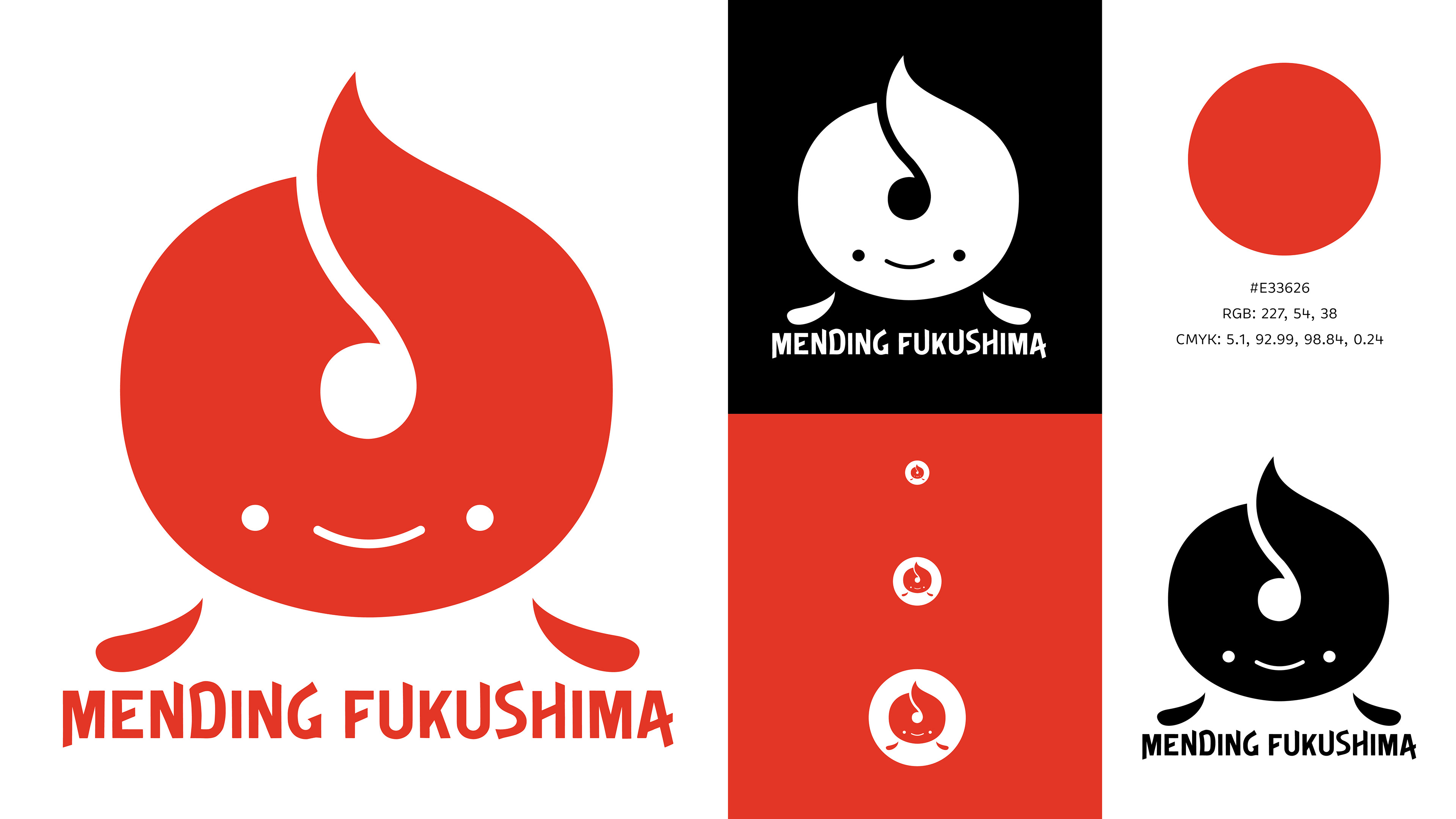
I experimented with multiple concepts during the sketching process, but ultimately, the decision was made to draw inspiration from the Fukushima prefecture’s flag. Specifically, the shape of the flag’s symbol as well as the colors of the flag were incorporated into the final design.


The creative exploration process involved a series of iterations and experiments aimed at refining the design elements. Multiple variations were considered, including diverse color palettes and outlines. Ultimately, a minimalist color scheme of red was deemed most suitable for the final design. Further refinements were made by testing different proportions and sizes for the symbol’s facial features and “feet.” This process allowed for the careful honing of the logo’s visual appeal and legibility. In addition, typeface options were also explored and integrated into the final design.
