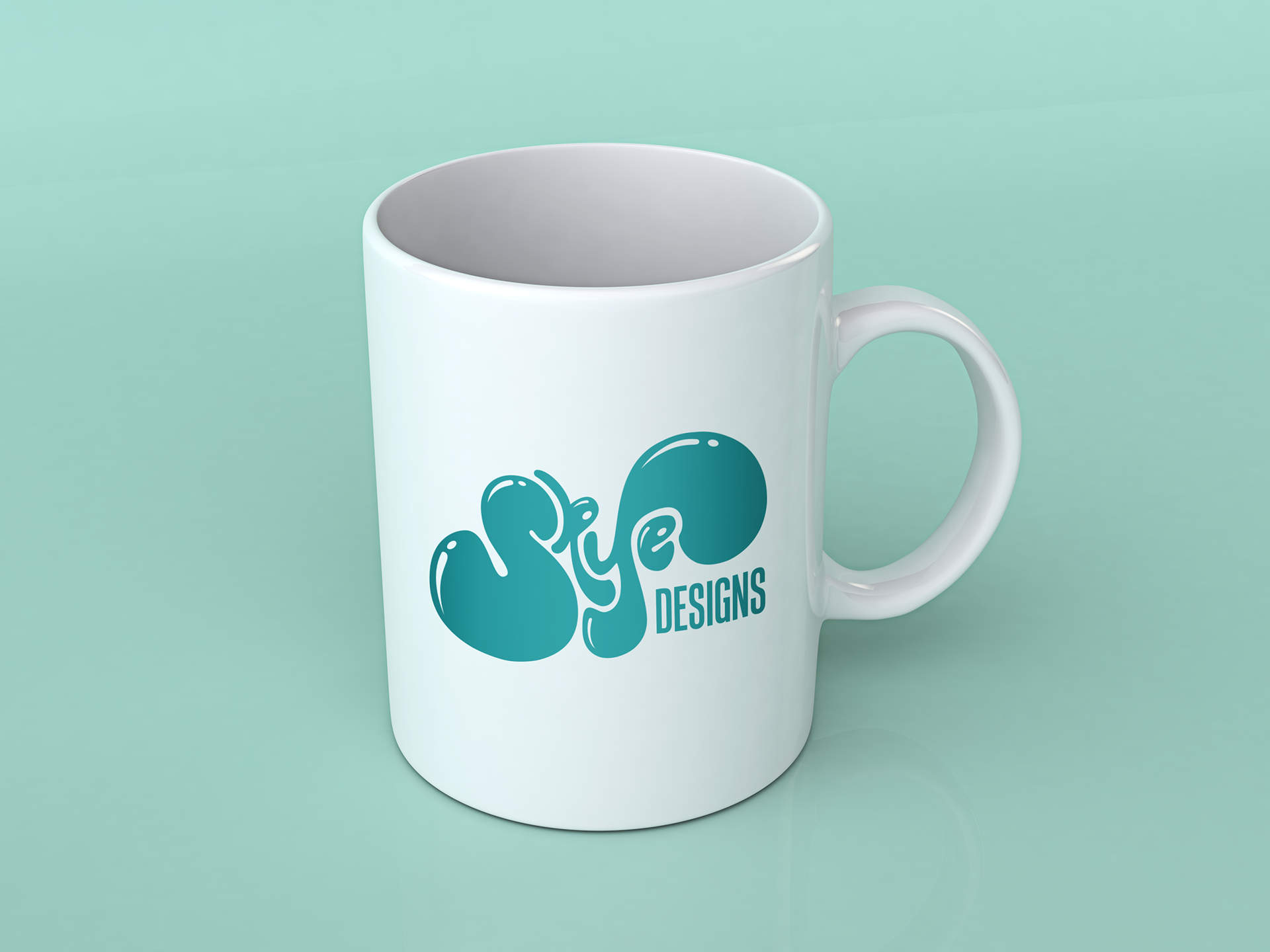
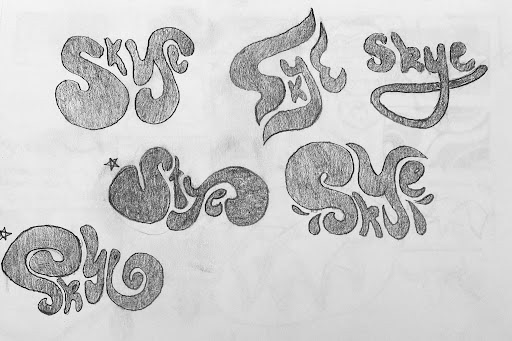
To achieve this goal, extensive research and experimentation were conducted, exploring the designs of other established logo designers for inspiration. I was particularly intrigued by the use of interlocking letters in many of the examples and sought to incorporate a similar technique in my own logo design.
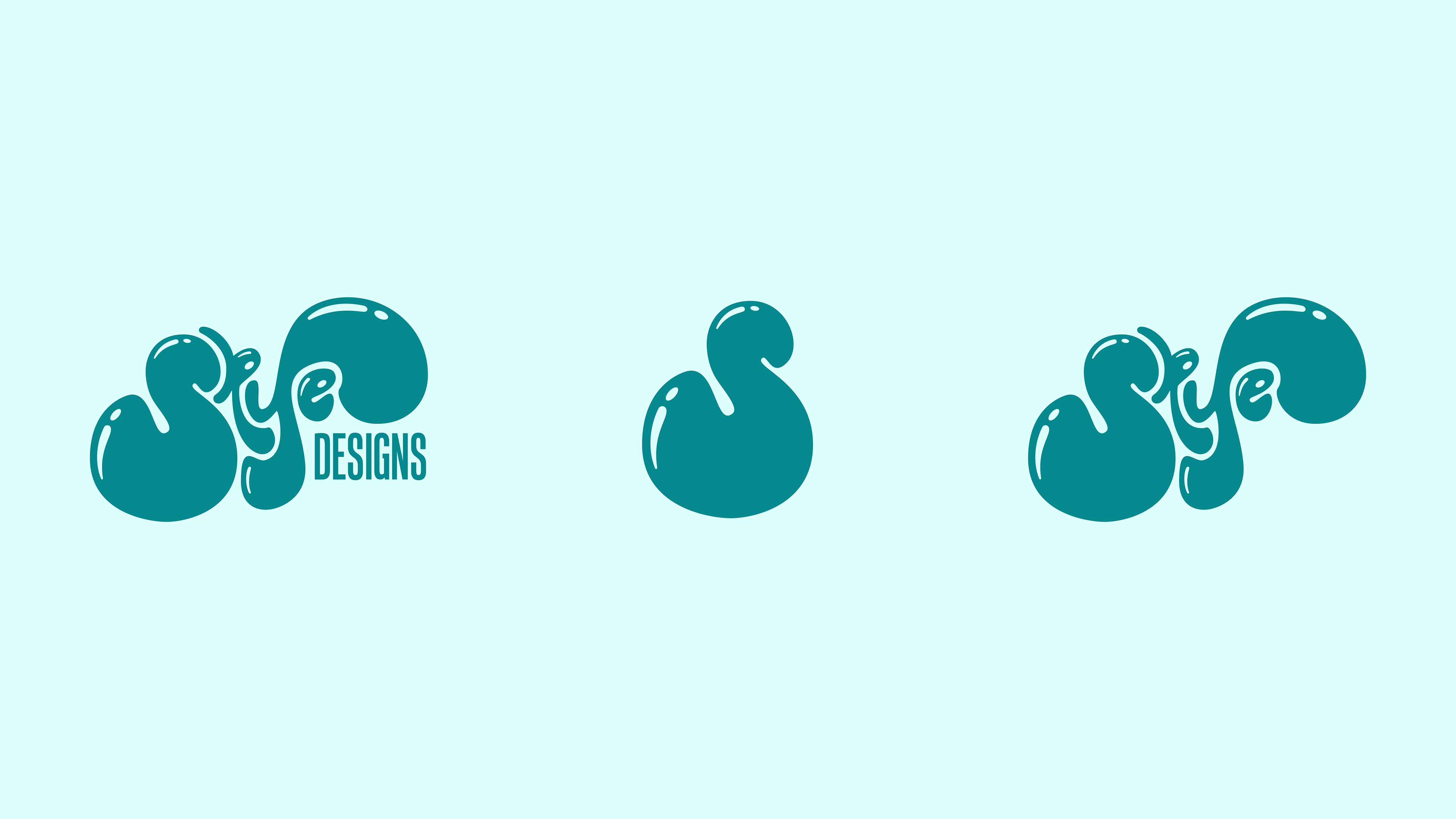
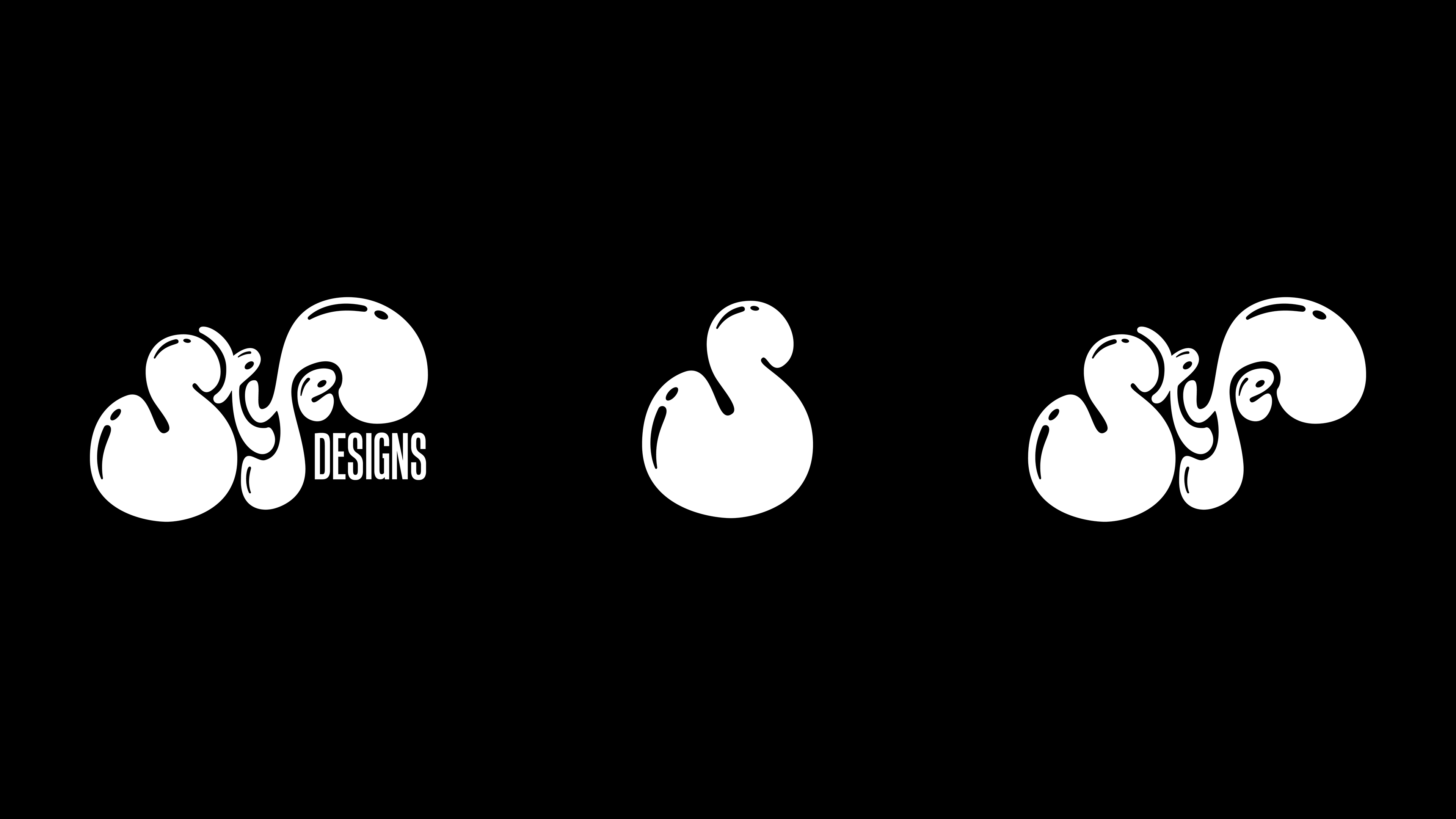
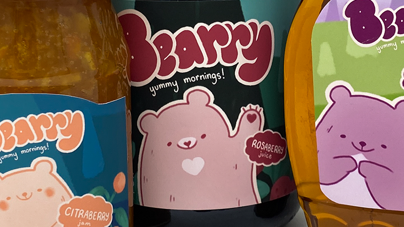
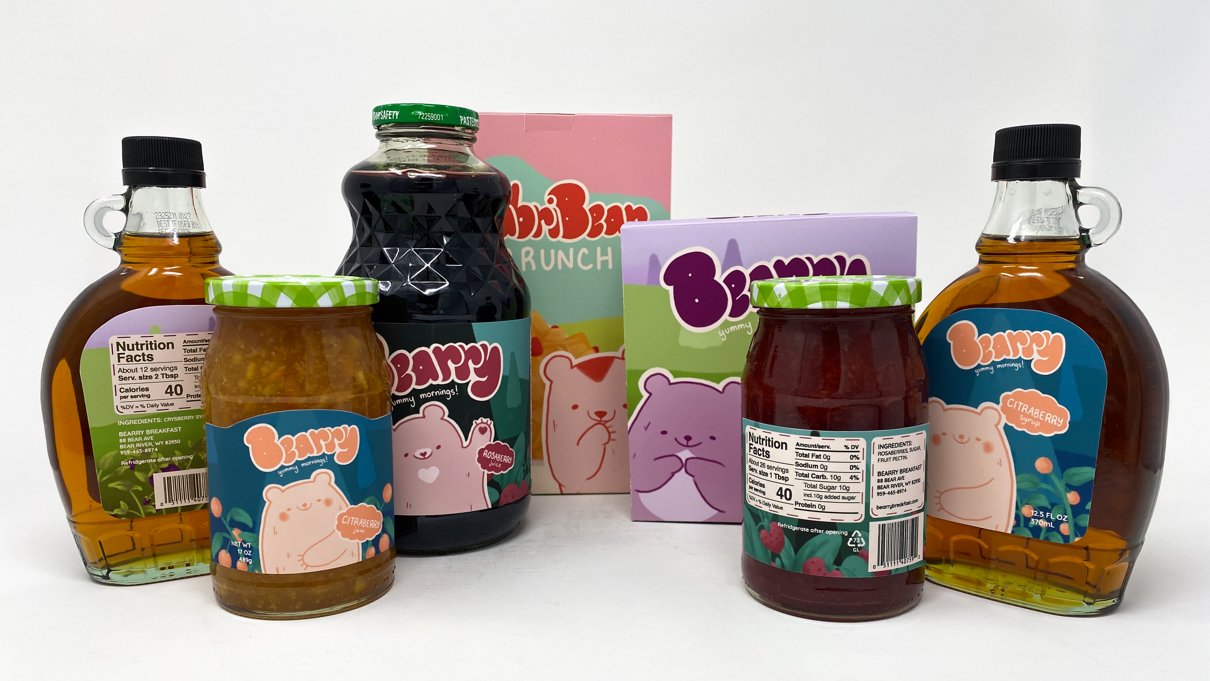
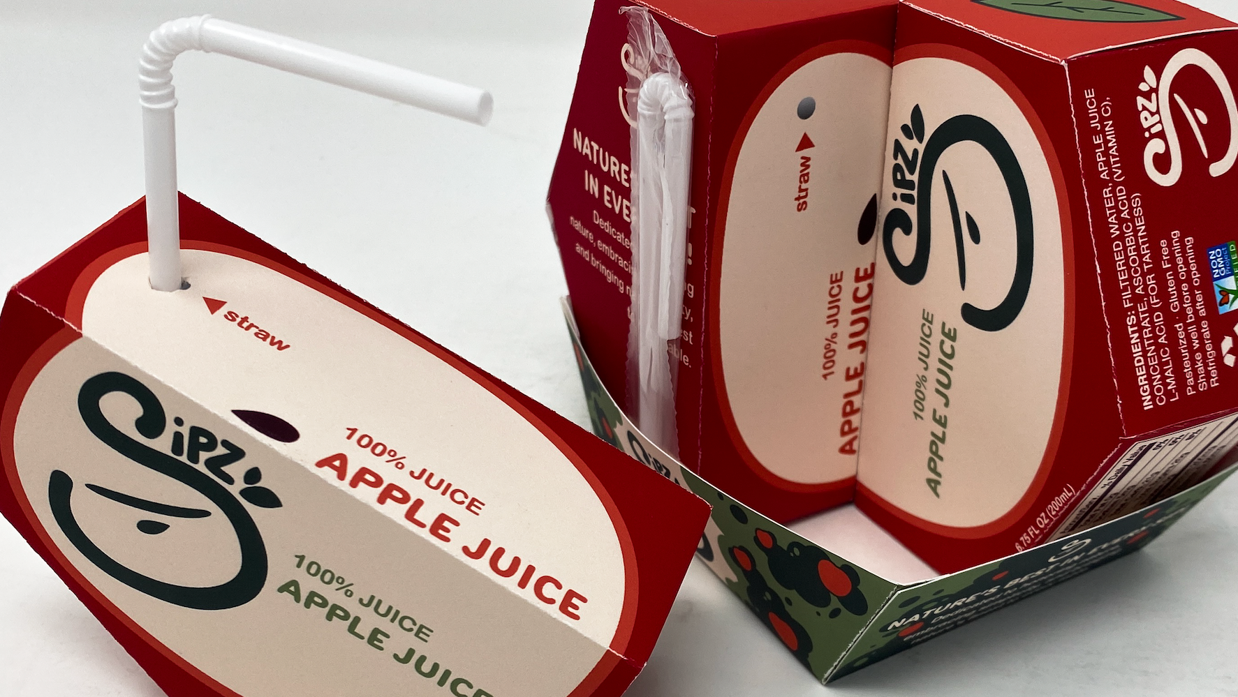
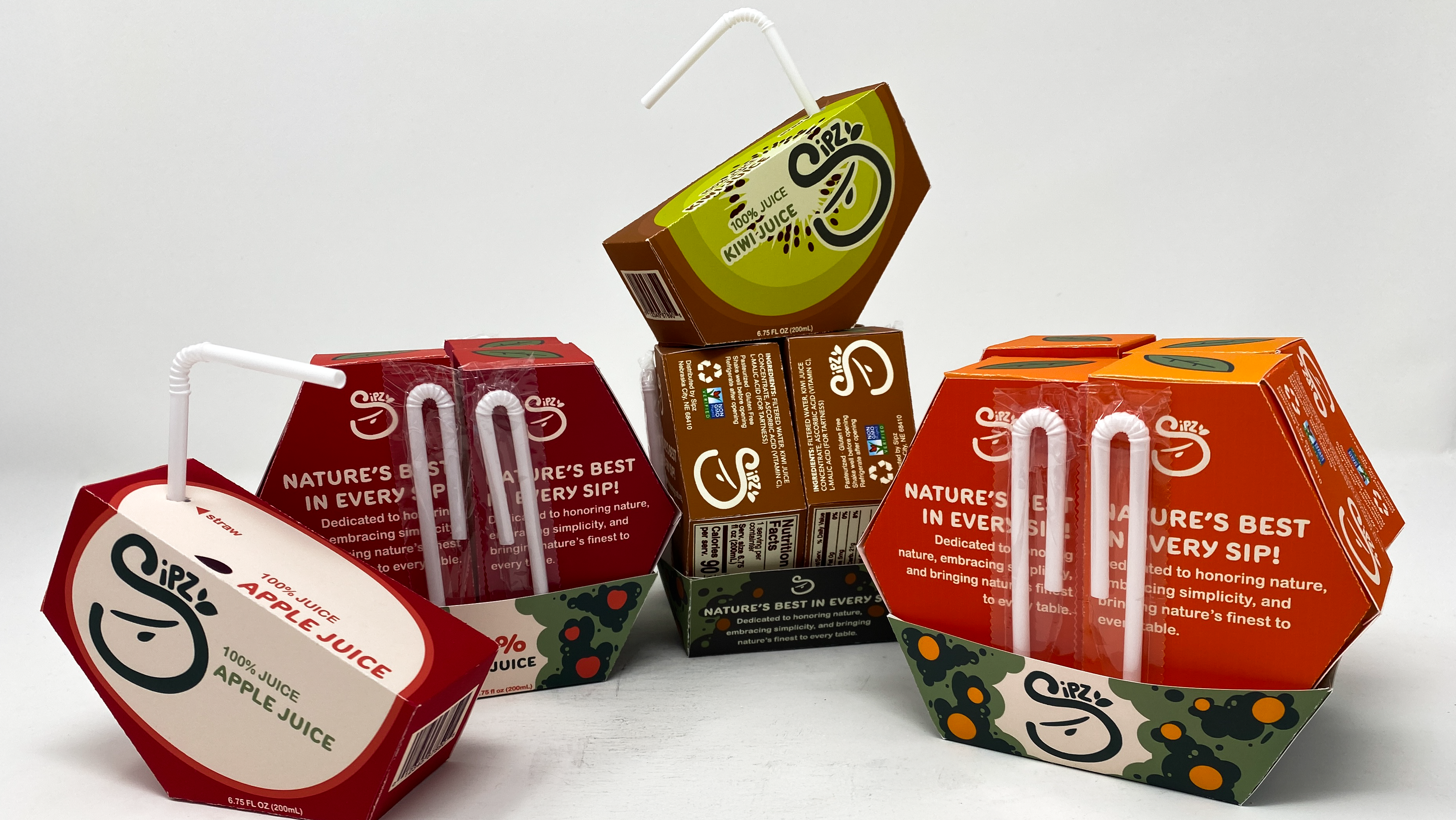
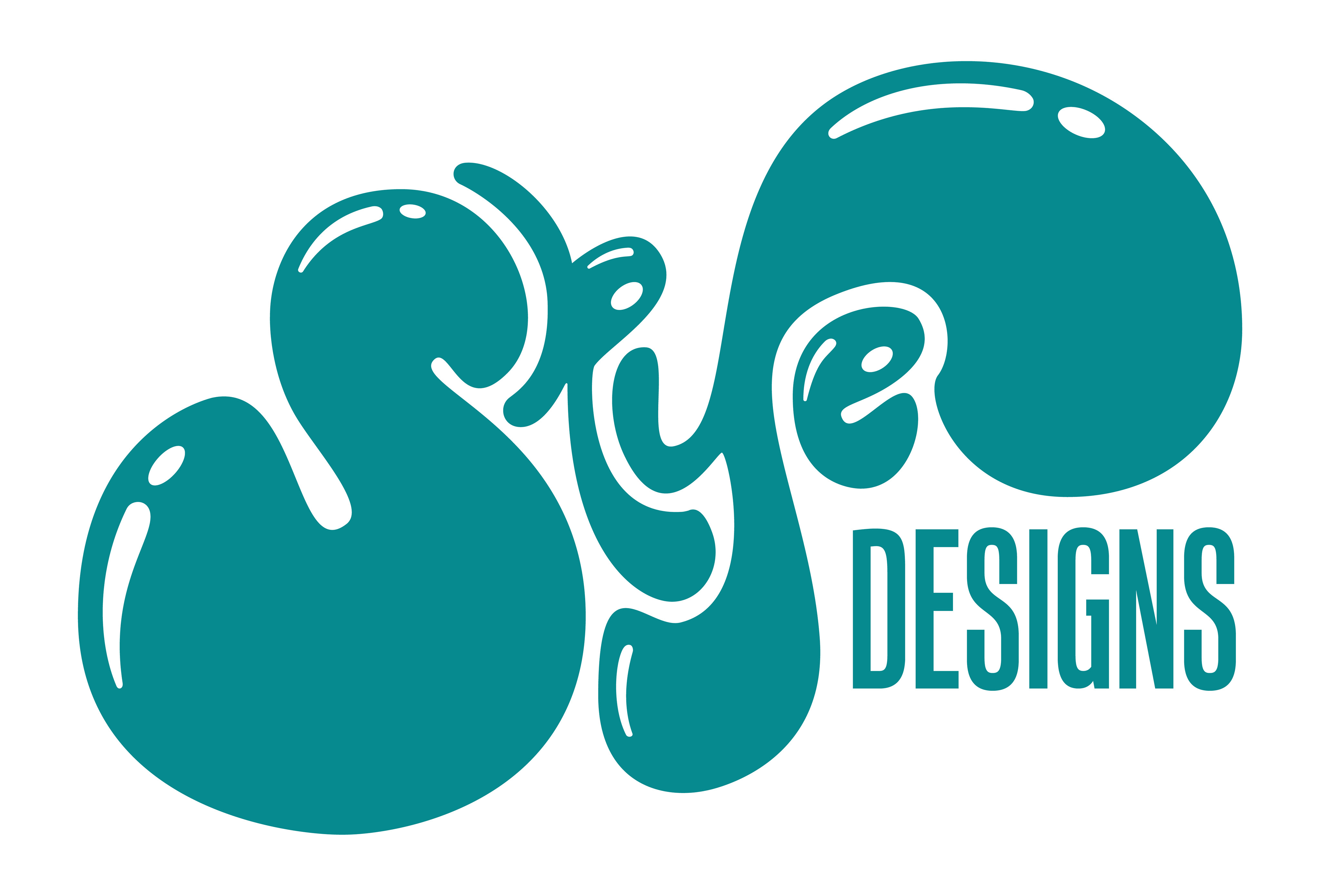
Through a diligent sketching process, a distinctive and visually captivating logo concept was created, showcasing my artistic skills and my brand’s character. The chosen concept is a memorable logo, blending a cute and bubbly appearance with a uniquely odd touch.
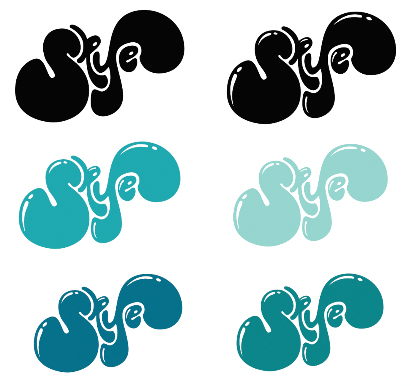
After settling on a promising design concept, I proceeded to explore colors and visual effects to determine the optimal combination for the logo. Following the selection of a suitable color, various typeface options were examined in relation to the logo design. In particular, I sought to identify a font style that would effectively complement the logo while filling the available space in a visually appealing manner. Through testing, it was concluded that taller fonts provided the most satisfying results, ultimately enhancing the overall aesthetic of the logo design.