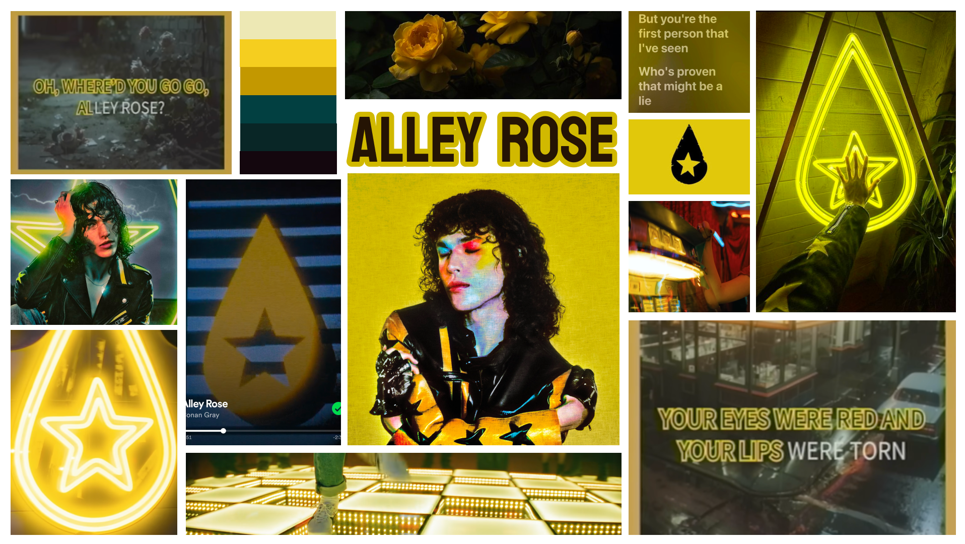
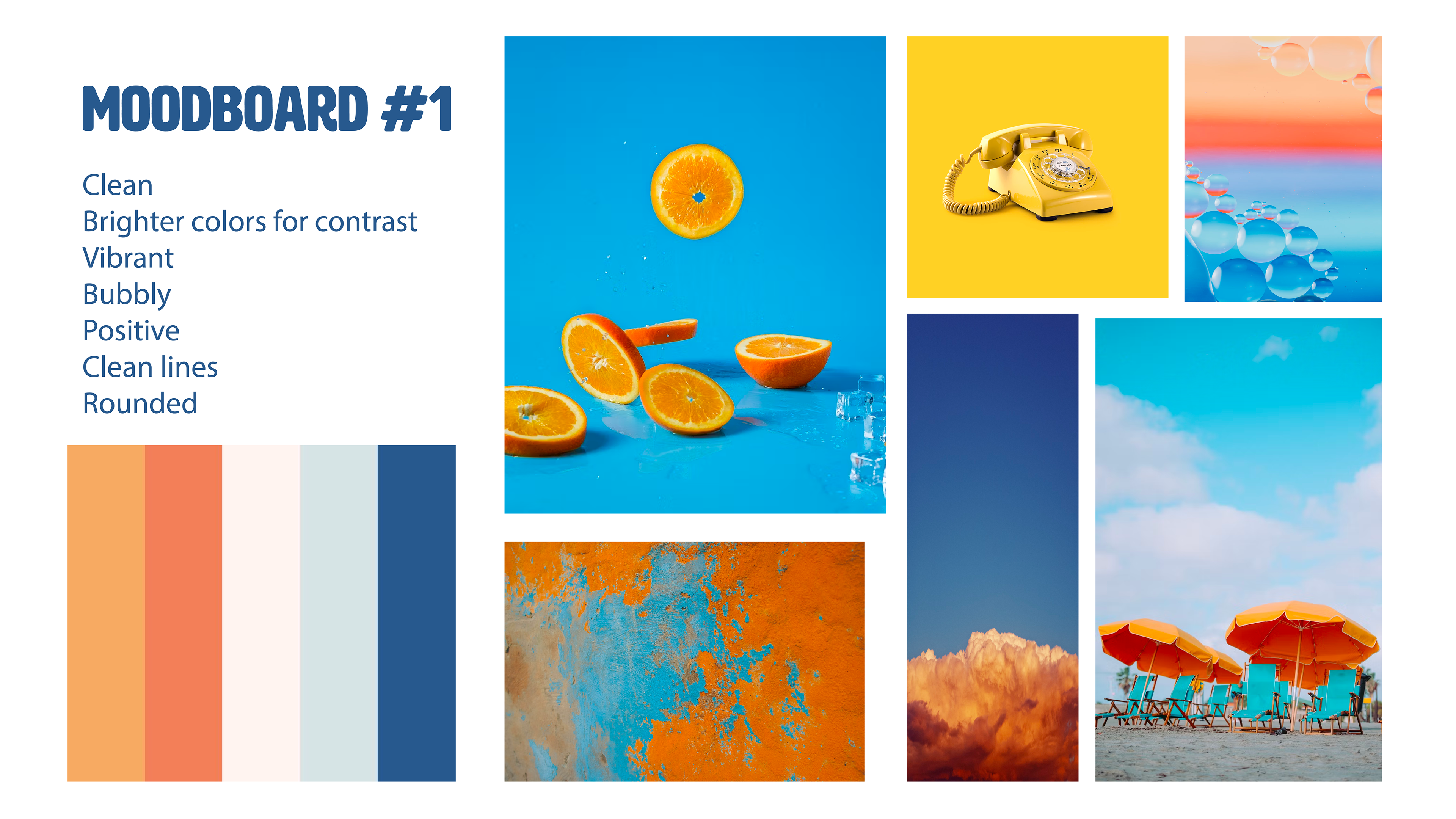
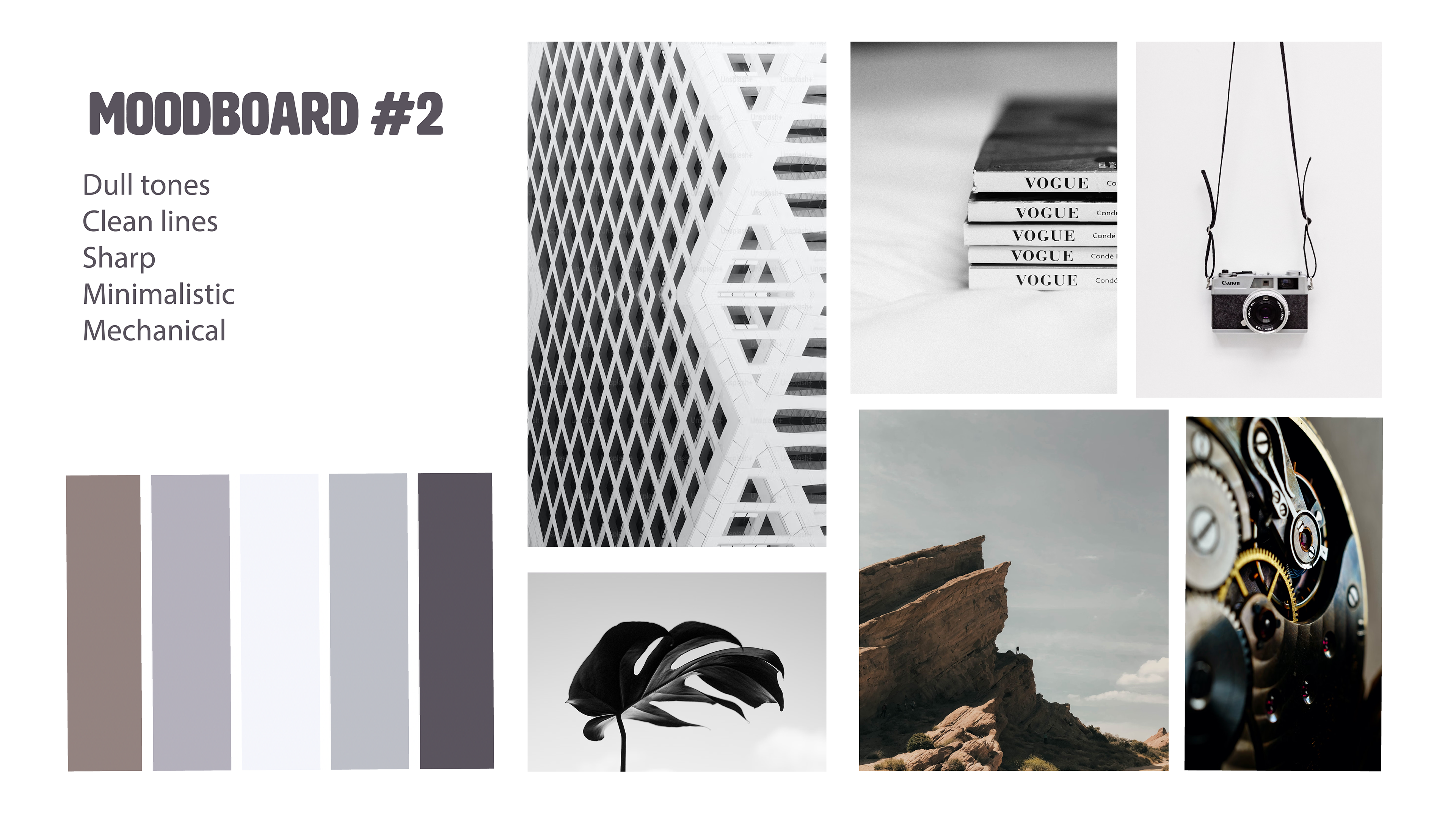
I began the process by starting two different moodboards based on the overall aesthetic of the brand I chose. In the end, I chose the second board as it fit the brand's identity much better.
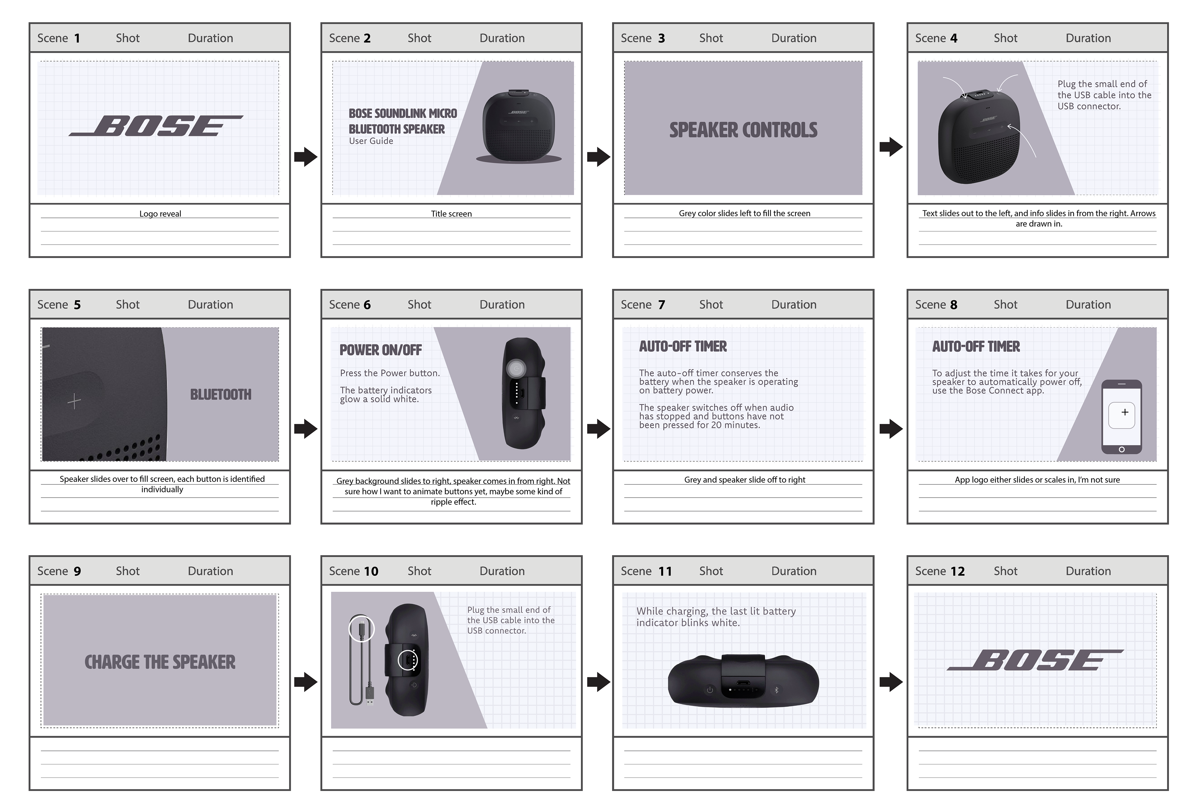
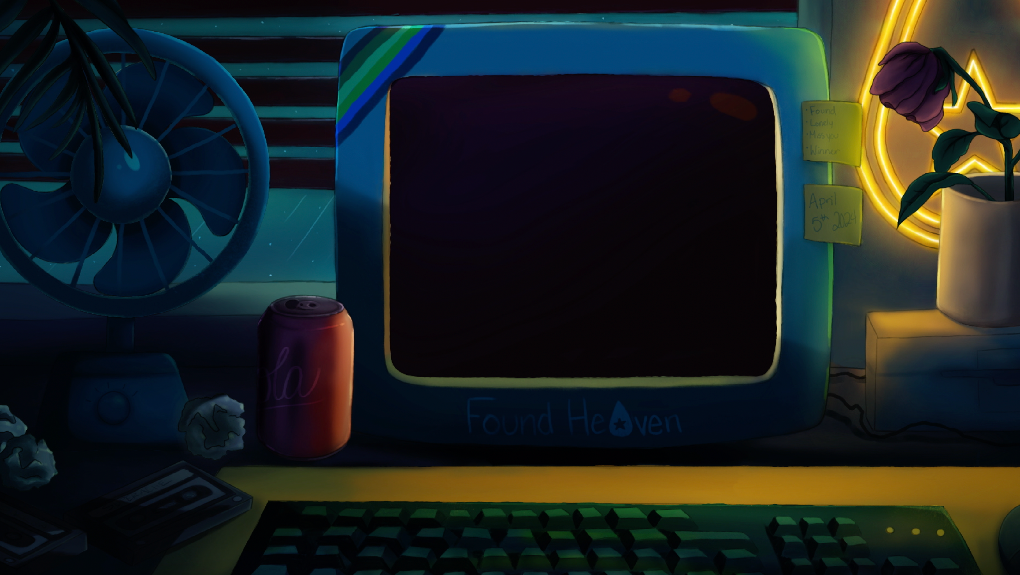
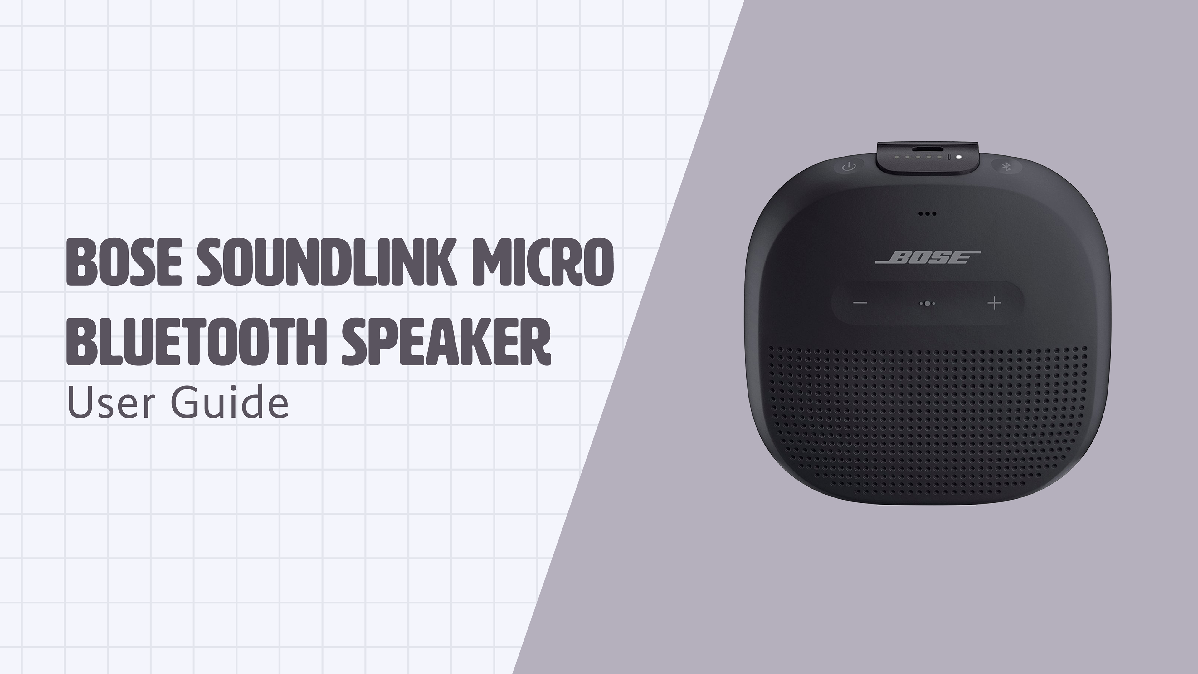
I then worked on a storyboard for my animation. My goal was to cover the basic controls of the device.